OM3RI
OM3RI is a yoga practice space shaped by return, repetition and real life. It does not position yoga as escape, transformation or performance, but as something steady that sits inside the rhythm of everyday living.
The brand exists between devotion and design, spirituality and city life, discipline and softness. Everything it communicates should feel grounded and integrated rather than elevated or aspirational. OM3RI is not selling intensity, it is holding space for consistency.
-
Developed a considered logo system, designed for flexibility across digital and print applications.
-
Created an in-depth brand manual outlining tone of voice, visual direction, typography, layout principles, and practical implementation guidelines to ensure long-term consistency.
-
Built a strategic colour system informed by consumer psychology and brand positioning, balancing emotional resonance with functional clarity.
-
Designed a structured content framework, including editorial direction, rollout planning, and scheduling systems to support sustained brand presence.
-
Set up and integrated bespoke practical brand management tools, ensuring assets, templates, and workflows are organised, scalable, and easy to maintain.
-
Provided continued creative consultation, refining direction as the brand evolves and ensuring alignment across touchpoints.
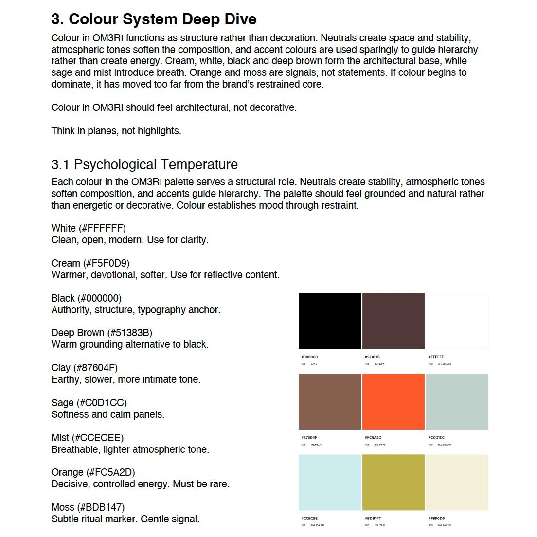
fig 1. snippet from the style guide
Due to brand privacy agreements we cannot share the full guide as it contains sensitive brand information
fig 2. Base Logo Icon


fig 3. Logo Example 1
fig 4. Logo Example 2